CROQUETEO
a fun and sensual identity for a croquette food truck
Overview
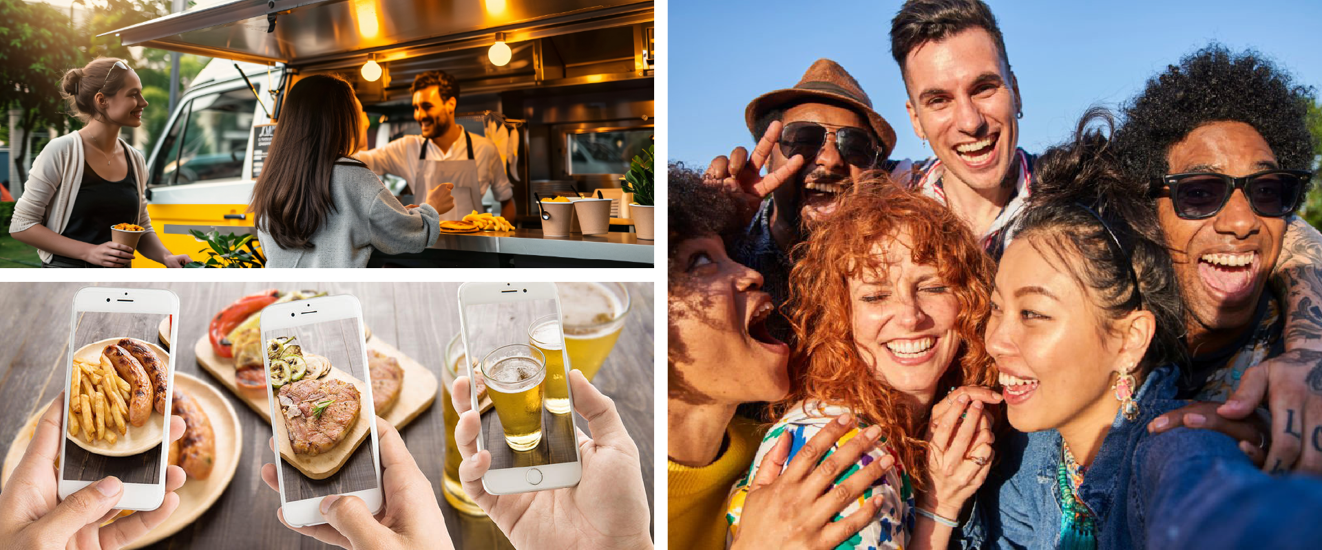
Croqueteo is a street food truck concept that turns something as simple as a croquette into a bold, playful, and irresistible experience. More than just food on wheels, it’s a full sensory adventure—one that starts with a flirty logo and ends with a perfectly golden bite.
Croqueteo dares you to slow down, break the ice, and let a croquette be your best excuse to start something.
Outcomes & Impact
82% of surveyed young adults had never seen a croquette-only food truck—validating a strong market gap.
78% interest rate from our core target (18–35-year-old Barcelona), confirming brand resonance.
Consistent brand rollout across digital and physical assets created a recognizable and cohesive identity in a saturated market.
THE CHALLENGE
How might we design a food truck concept that stands out in Barcelona’s saturated street food scene?
In a city where food trucks pop up at more than 500 events each year, standing out takes more than just a great recipe. Younger audiences are drawn to brands that are bold, shareable, and emotionally engaging. The challenge was to craft a concept that defied expectations—craveable, approachable, and irresistible from the very first glance (and bite).
THE SOLUTION
Croqueteo reimagines the humble croquette through the lens of flirtation and pleasure. With daring art direction, vibrant colors, and playful symbolism, it builds an immersive brand that invites people to engage, share, and belong—not just consume.
Our approach was anchored in three core principles:
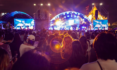
Festival-first positioning
We anchored the concept around high-traffic festivals like Primavera Sound—spaces where standing out is essential and brand personality becomes part of the experience.
Kitsch meets clever
The name merges "croqueta" and "coqueteo", setting the tone for a fun and cheeky visual world that breaks free from minimal, overdone “gourmet” styles.
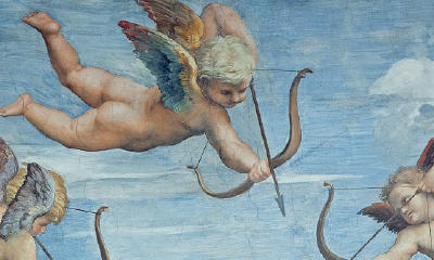
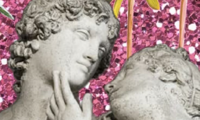
Symbolic seduction
Instead of defaulting to clichés, we explored flirtation through abstract references—Rococo patterns and mythological metaphors—that hinted at pleasure without being literal.

DESIGN PROCESS
Working alongside Ruth García, Montse Grau, and José Morante, I led the visual direction through a collaborative and iterative process. Every step was guided by real users and real moments—bridging creativity and strategy to build something that resonates.
1. Understand
We studied street food trends and competitor brands while analyzing major festivals to identify gaps in the market and user behavior.
2. Define
Croqueteo had to be visually loud, emotionally inviting, and functionally easy to eat on the go. Art direction centered around bold colors and a tone that felt both flirty and funny.
3. Ideate
From sketchbooks to screen, we explored dozens of iterations, prototyping assets that could live across the entire customer journey—from signage to packaging.
4. Iterate
We tested the branding with 15 festival-goers. Their honest feedback helped us refine typography, tone, and symbolism—sharpening the identity while keeping the spark.
FINAL DESIGN
The outcome is a rich, cohesive brand system documented for easy deployment. From the truck’s design to its packaging, flyers, and social media content, Croqueteo is built to perform—and to charm. It’s not just recognizable; it’s memorable, clickable, and worth talking about.


LEARNINGS
Balancing playfulness and sophistication
Designing with humor doesn’t mean sacrificing refinement. Some of our best design choices were the subtle ones—layers of meaning that rewarded attention.
Francesc, Design professor: Croqueteo achieved a brilliant balance between playfulness and sophistication. Their approach shows creative maturity and a great eye for details that truly make an impact.
Consistency builds emotional connection
Cohesion isn’t just visual—it builds trust and emotional resonance. Carrying the same tone across every element helped make the brand feel alive and personal.
Marina, Testing participant: I loved how everything felt cohesive and well thought out. The identity had personality, but most importantly, it was easy to recognize and remember. The small details made all the difference.
Flexibility and continuous improvement
Testing reminded me that no design is ever “done.” Feedback from users helped me shift from what looked good in theory to what actually worked in context.
Jordi, Branding professor: Seeing how the team adapted ideas in real time was impressive. They were open to change, but always had a clear vision. That balance kept the project moving forward with strength.
Want to see more?