ABOVE THE STARS
a brand identity for a corporate event inspired by Ancient Greeks
Overview
Above the Stars reimagines a corporate event as a celestial journey. Set in Athens, this annual CND distributor convention drew inspiration from the cosmos—blending Ancient Greek astrology with strategic vision to transform a standard business gathering into a mythic, immersive experience.
What could’ve been forgettable became unforgettable.
Outcomes & Impact
87% of attendees said the branding elevated their experience and helped them engage more deeply.
+40% message recall in post-event surveys, thanks to consistent and meaningful visual storytelling.
85% participation rate in interactive brand elements, reinforcing the power of experiential design.
THE CHALLENGE
How might we create a visually compelling and cohesive identity for CND’s annual distributor convention in Athens?
The CND EMEA Distributors Conference gathers over 130 international partners to align on goals and drive business growth. However, previous editions lacked cohesion, emotional connection, and a sense of place. Attendees found the branding forgettable, with disjointed visuals and little reflection of the host city’s identity. The challenge was clear: create a sophisticated visual universe that honors CND’s values while tapping into the grandeur of Athens—making each attendee feel like part of something rare and significant.

THE SOLUTION
We crafted a brand identity grounded in astrology—a central pillar of Ancient Greek culture—using it as a metaphor for clarity, alignment, and strategic foresight. The goal was to move beyond decoration, turning every design choice into a story.
Three key principles guided the solution:
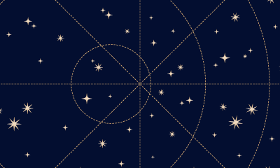
Celestial creative concept
The event narrative positioned attendees as constellations—each one essential to the brand’s evolution. Astrology became a visual and symbolic thread across all materials.
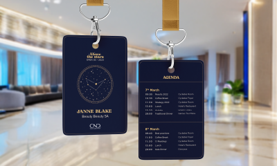
Personalization for connection
Custom name badges, celestial kits, and interactive pieces made each guest feel individually seen while reinforcing collective purpose.
Cohesive execution
Typography, motion, print, and digital assets all followed one elegant, refined direction—ensuring consistency and elevating the brand across every touchpoint.

DESIGN PROCESS
Working side-by-side with the event’s project manager, I followed a research-led and iterative approach to align the branding with both strategic goals and emotional resonance.
1. Understand
User interviews uncovered a desire for meaning, not just aesthetics. Research into Athenian culture surfaced three thematic directions, and astrology emerged as the strongest—symbolic, inclusive, and visually rich.
2. Define
We honed in on a sophisticated, international audience (ages 30–60) seeking purpose, recognition, and inspiration. The visual identity had to reflect collective ambition while feeling timeless and celebratory.
3. Ideate
Through moodboards, sketches, and visual testing, we developed a design language that balanced mystique with clarity. The logo was refined to feel both celestial and corporate—anchored yet imaginative.
4. Iterate
20 feedback sessions with participants helped us refine usability across materials. Whether adjusting contrast in decks or enhancing print legibility, each small change made the identity stronger and more immersive.
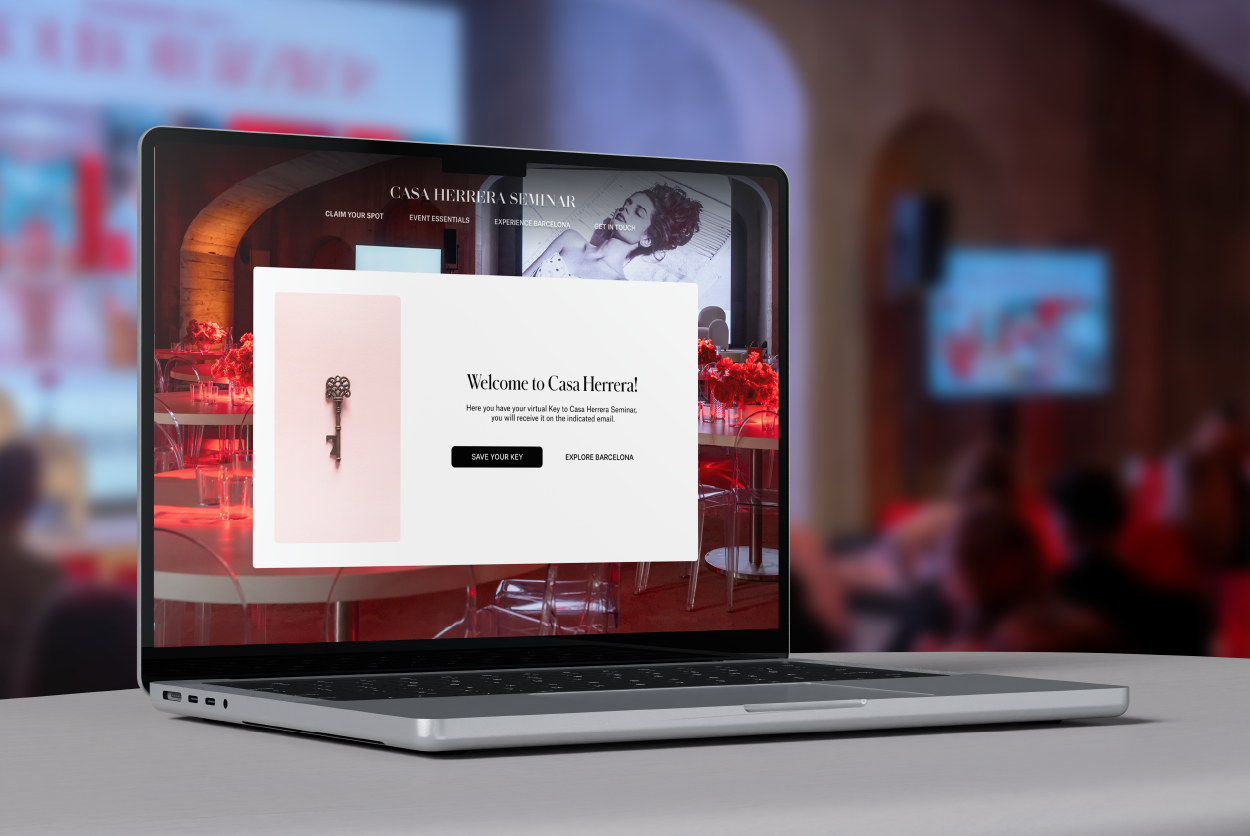
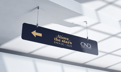
FINAL DESIGN
The final identity came to life across every corner of the event: from digital keynotes to signage, custom kits, and ambient graphics. Every detail echoed the central theme—turning the convention into a unified, elevated experience. More than branding, it became a story attendees could step into.


LEARNINGS
From concept to experience: turning vision into story
The real challenge wasn’t just creating a beautiful identity—it was making it mean something. Translating abstract symbolism into concrete touchpoints taught me how narrative can shape the emotional arc of an event.
Sophie, Event Attendee: The branding felt truly immersive—every detail made us feel part of something special, like we were stepping into another world. It wasn’t just an event; it was an experience.
Bridging strategy and aesthetics across touchpoints
This project showed me how much power lies in cohesion. Whether digital or print, every asset had to serve a consistent message. Designing within those constraints sharpened my ability to balance beauty and clarity across mediums.
Ana, CND Marketing Lead: Above the Stars branding elevated the event—attendees engaged with the materials effortlessly, and the cohesive visuals strengthened our key messaging. The attention to detail truly made a difference.
Iterate, adapt, elevate: the power of feedback
Involving real users throughout the process led to valuable, sometimes unexpected insights. Refining typography and visual hierarchy made the materials more accessible without compromising elegance. The result was a stronger, smarter brand experience..
Alba, Event Manager: I’ve seen many event designs—but this one stood out. Clear, elegant, and intuitive. You could tell every element had been thoughtfully refined.
Want to see more?